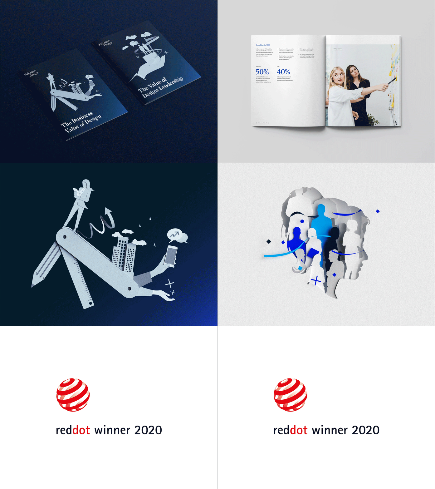
One thing’s clear, design’s impact on business can no longer be ignored. Earlier this year, we launched a cohesive visual identity for our Business Value of Design series, which links an organization’s design actions to increased financial performance.

And people are starting to pay attention. The reports are among McKinsey’s most viewed articles this year, and today, we are thrilled to announce that the Business Value of Design series has been recognized with a 2020 Red Dot Award for Brand & Communication Design.
The award, which recognizes “the best brands and creative works of the year,” is one of the largest and most prestigious design competitions in the world. In 2019, the Brand & Communications category evaluated almost 9,000 entries from around the globe with 24 international design experts on the jury.
“I had a fantastic time working on this project,” said McKinsey Quarterly Art Director Maya Kaplun. “The most exciting part of it for me was experimenting with our new brand in fresh and unexplored ways. Seeing the project transition ‘from a page to a stage,’ finding solutions to expand the visual language—this type of problem solving is what I enjoy most about design.”

The Business Value of Design is an industry-defining research series that puts a spotlight on design's value for business and organizations. The series is aimed at CEOs on behalf of designers so naturally it required a compelling and accessible design language. For the visual component, we partnered with the London-based agency Human After All to develop a striking look for the series.
“Our vision was to create a distinct visual approach—a bold, characteristic identity that stemmed from the newly-refreshed McKinsey master brand and that would help set the visual tone for the Value of Design ecosystem,” said Paul Willoughby, executive creative director for Human After All.”

“We crafted a paper cut illustration style in monotone to illuminate the core narrative in a way that would celebrate the design space. The simplicity of white paper relates to the design process—it’s where many great ideas begin for designers and creative thinkers alike. The clean, crisp, flowing lines of paper cut are a perfect stylistic addition to the McKinsey master brand, extending its potential to speak to a design-curious audience.”
The clean flowing lines of paper stylistically convey complex topics around the human side of design leadership, contrasted with user friendly graphs to visualize data. The visual language extends beyond pixels, to print reports that stand out. From black stapling to clear outer foil, our print materials were carefully chosen to align every element with the new brand.

Check out the award-winning series for yourself here.