Our Charting the Path to the Next Normal series offers a daily chart that helps explain a changing world—as we strive for sustainable, inclusive growth. Here we’ve curated 22 of this year’s best data visualizations that have illuminated some of the key themes and trends covered in our publishing—inflation, geopolitical upheaval, evolving health priorities, inclusion, net zero, digital trust, and more. Together, they capture a lot of what our collective next normal looked and felt like in 2022. Browse through the charts below to learn more about the storylines that could resonate well beyond this year.
Resilience becomes essential
Leaders continue to confront multiple crises: a geopolitical conflict, rising inflation, the lingering effects of the COVID-19 pandemic, and talent turnover. The challenges have called for broad resilience frameworks.
The year kicked off with a big hole in the US labor market. The number of job openings (10.9 million) exceeded the number of new hires (6.3 million), as people continued to quit their jobs—often without another one lined up. According to our survey, uncaring leaders, unsustainable expectations of performance, and lack of career advancement were key reasons employees left the workforce. What lured workers back? Workplace flexibility and adequate compensation topped the list.
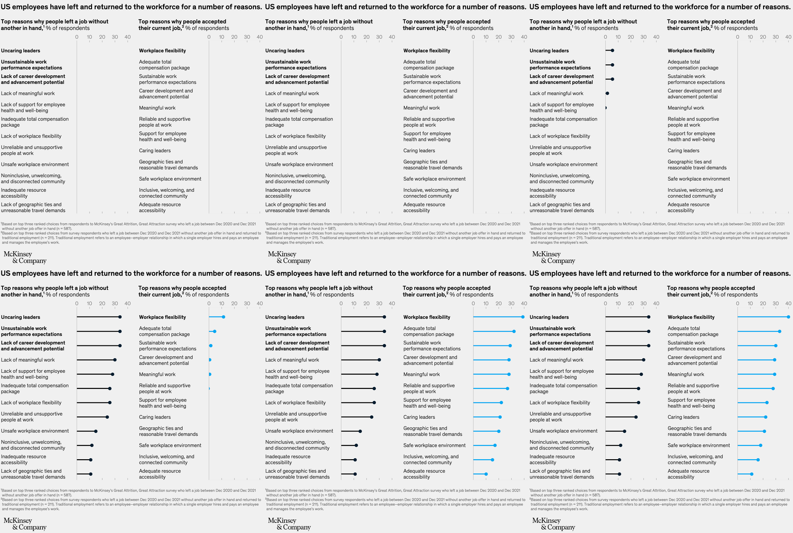
Image description:
Two side-by-side bar graphs each showing the top 12 reasons why US employee respondents either left an old job or accepted a new job.
The top three reasons for respondents leaving a job without another in hand were:
- Uncaring leaders
- Unsustainable work performance expectations
- Lack of career development and advancement potential.
The top three reasons for respondents accepting their current job were:
- Workplace flexibility
- Adequate total compensation package
- Sustainable work performance expectations.
End of image description.
The war in Ukraine prompted a swift response from corporations. By the end of April, 70 percent of the Fortune 500 companies operating in Russia prior to the invasion opted to leave or scale back their business once the conflict began. The exodus spanned multiple sectors, such as industrials, consumer goods and services, and energy and materials. The corporate response indicates that, more than ever, core management choices are being shaped by a set of stakeholders beyond investors, including employees and customers.

Image description:
Three vertical columns of arranged dots representing Fortune 500 companies with a presence in Russia, before and after the Invasion of Ukraine. The dots are collected into circular groups for each of the company’s areas of production. They are further broken down into two colors, one color representing those whose headquarters are in Europe, the UK, or the US, and the second color for headquarters in all other regions.
These groupings of circles of dots in two colors are stacked vertically above one another by their different area of production. A final layer of information is then broken off by arrows pointing in one direction for companies still in Russia, and in the other direction for those that have left Russia as of April 28, 2022. Both those that are staying and those that have left Russia are represented left and right in the same colored-dot configuration, broken by HQ location.
The visual indicates that many more have left Russia than have remained behind.
End of image description.
In inflationary times, investors often turn toward commodities because their prices reflect the demand for raw materials needed for economic expansion. After the COVID-19 pandemic punctured the global economy, government stimulus helped push commodity prices back to their 2010 average and then higher. Russia’s invasion of Ukraine sent prices higher still, with the cost of energy, crops, metals, and more affected by the conflict. Due to shortages of natural gas and rising demand from farmers, fertilizer had the sharpest rise.
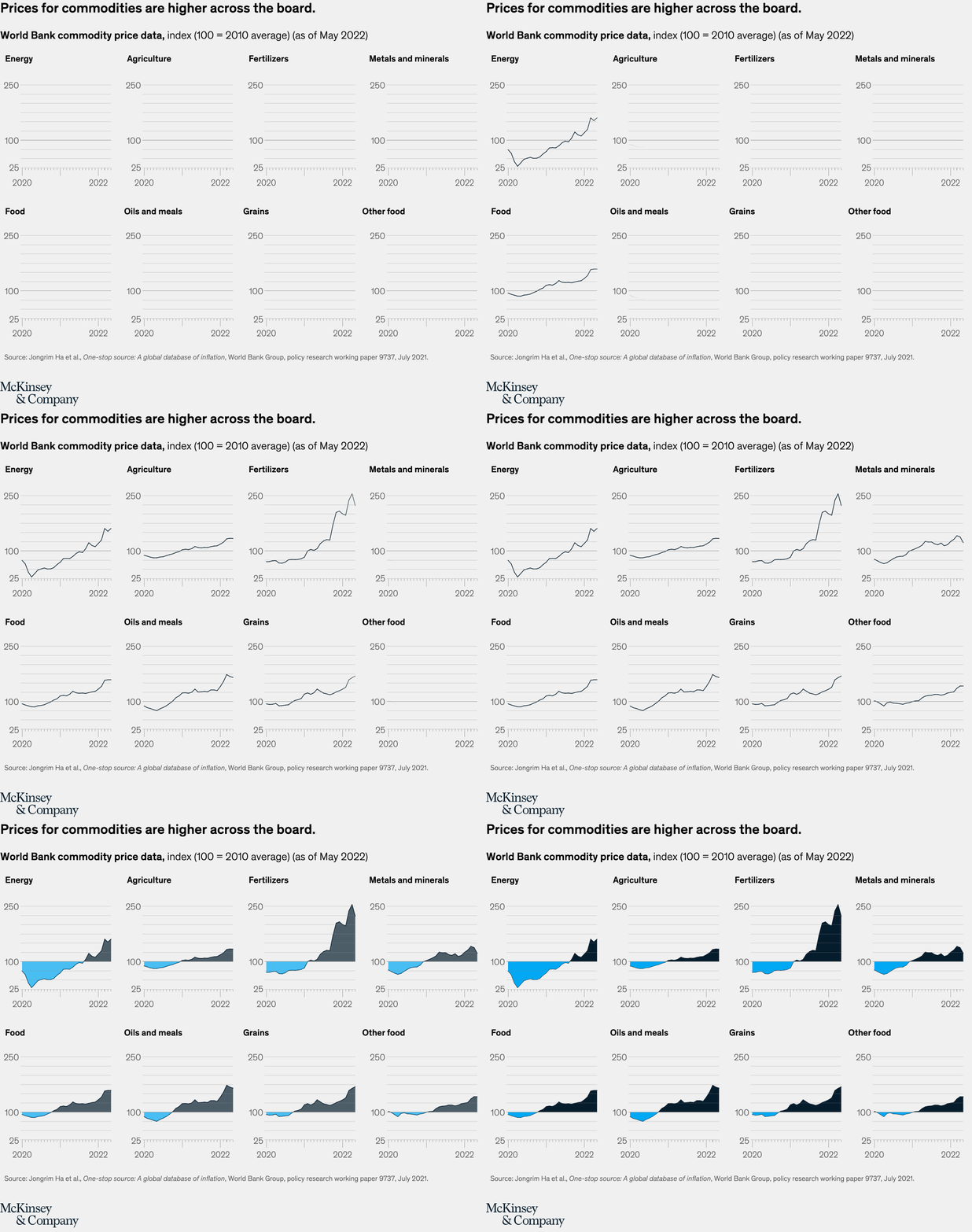
Image description:
A series of eight line graphs covering the monthly change in global commodity prices (including Energy, Agriculture, Fertilizers, Metals and minerals, Food, and Grains) from January 2020 through May 2022, represented as an index with 100 equaling the 2010 average. The graphs start out on or well below the index line of 100 in 2020, but before the end of 2020 all have ascended beyond as prices for all commodities have increased.
End of image description.
As the Great Attrition went on unabated, with quit rates 25 percent higher than prepandemic levels, organizations found they couldn’t rely on old ways to attract and retain talent, as the same types of workers weren’t always available to fill those roles. Only 35 percent of people who left their jobs since the start of the pandemic took another one in the same industry. Companies that expand their talent-sourcing approach can expect better success for drawing different types of workers.

Image description:
A circular representation of 100% of all workers who quit their jobs between April 2020 and April 2022. Each percentage point is visualized as an individual human silhouette. The 100 people are further proportionately broken into three colors. Each color represents a different result after quitting: 17 did not return to the workforce, 48 moved to a different industry, and the remaining 35 took a new job in the same industry. A further highlighted box points out that a full 65 out of 100 people did not return to the same industry.
End of image description.
Anxiety about inflation caused consumer confidence to plummet in the United States. However, our research on consumer spending from this summer revealed that some categories were experiencing double-digit growth, including grocery stores (sales up 12 percent), cosmetics (up 16 percent), and pet supplies (up 11 percent). The data suggest that, during inflationary times, companies can still make intentional bets for longer-term growth. Click through the interactive to compare US consumer spending in different categories.
After yet another year of unexpected turbulence, one word was on leaders’ lips: resilience. Past crises have shown that resilient organizations bounce back better—and even thrive—during times of disruption. Companies categorized as more resilient generated greater shareholder value than less-resilient peers across the entire life cycle of the major economic shocks of the past two decades, including the financial crisis of 2007–09 and the COVID-19 pandemic. To work toward sustainable, inclusive growth in these times, organizations can consider a new approach to resilience—one that is more adaptable to disruptions and changes.

Image description:
Two side by side line graphs, one wider and covering more years, and one narrower and covering fewer years.
The first line graph shows total shareholder return performance beginning in the 2008 financial crisis. The data is represented as an index with 100 being equal to 2007 average shareholder return. The downturn and recovery from the crash are marked, and three data sets are shown as different colored lines on the graph: one line for resilient companies, one for nonresilients, and between them the S&P 500 stock market average as a benchmark. Resilient companies far outperform the nonresilients and also outperform the S&P 500.
The second line graph shows total shareholder return performance beginning at the most recent market crash during the COVID-19 pandemic. The data is represented as an index with 100 being equal to 2019 average shareholder return. Three data sets are shown as different colored lines on the graph: one line for resilient companies, one for nonresilients, and between them the S&P 500 stock market average as a benchmark. Again, resilient companies far outperform the nonresilients and also outperform the S&P 500.
End of image description.
Health priorities evolve beyond the pandemic
The COVID-19 crisis upended businesses and transformed health systems. As certain parts of the world shift from the pandemic to endemic stage, leaders across public and private sectors are exploring new ways of improving health outcomes.
Looking back at mid-2021, portions of the globe had inched toward the endemic stage of COVID-19, largely due to the virus becoming widespread and the availability of vaccine boosters and therapeutics (antibody treatments, for example). McKinsey’s COVID-19 Immunity Index, designed to assess a community’s current level of risk and degrees of protection over time, pointed to a drop in immunity levels in the winter of 2021–22 in several countries as the Omicron variant spread. We also observed that vaccination remained an essential element in building immunity.
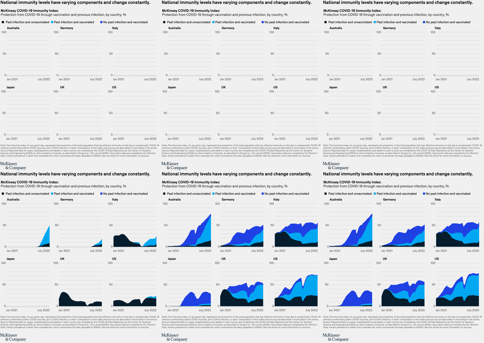
Image description:
A series of six area graphs showing COVID-19 national immunity levels for six nations starting in January 2021 and ending in July 2022. Included are Australia, Germany, Italy, Japan, the United Kingdom, and the United States. The graphs are broken into three color bands. One for immunity driven by past infection of unvaccinated people, one driven by past infection of vaccinated people, and the final one driven by those who had no past infection but who had been vaccinated. Each of the graphs is generally trending upward in national immunity but the supporting levers to immunity shift and change. Australia is the closest to national immunity, clearly driven by vaccinations.
End of image description.
Healthcare providers and policy makers are keeping a watchful eye on the lingering COVID-19 pandemic. With tests, vaccines, and treatments for the virus more readily available in the United States, leaders are eyeing broader health issues in hopes of laying a foundation for more resilient and equitable public health systems. This may be facilitated by capturing some of the $4 billion in grants provided to public health departments by the Centers for Disease Control and Prevention. To identify states’ most pressing health needs, McKinsey created its interactive United States of Health Dashboard, highlighting key metrics such as maternal health and chronic disease.

Image description:
A series of fifty spider graphs presented in the shape roughly resembling the United States. Each spider graph has five segments representing one of five public health outcomes. The segments include maternal health, behavioral health, environmental health, chronic diseases and communicable diseases. Each spider graph contains five pizza-slice-shaped ratings, each broken into four quartiles scores, with the bottom quartile performance barely showing and the top quartile performer filling the available space. Each spider graph then shows how each of the states does by which quartile they are in for each of the five metrics.
A pattern of poor performance overall can be seen for many of the southern and central states, with others doing poorly in individual segments.
End of image description.
Virtual health services soared with the onset of the COVID-19 crisis—telehealth visits rose more than 3,000 percent early in the pandemic. Continued investment in innovation around these services is essential—approximately $250 billion in outpatient spend has the potential to shift to virtual settings for office visits, urgent care, and home health services. McKinsey surveys also showed that satisfied patients using these models are 28 percent less likely than patients who don’t to switch healthcare providers and are up to six times more likely to see that provider for other healthcare services.

Image description:
A large square tree map represents the total outpatient, emergency department and home health spending in the United States. The tree map is broken into two areas: the larger area is nonvirtualized healthcare at around $1 trillion, and the smaller area (and focus of the exhibit) is virtual healthcare at $247 billion. The $247 billion box is further broken into smaller boxes proportionate to their dollar value, representing virtual healthcare areas such as urgent care, virtual and near-virtual office visits, virtual home health visits and home medication administration spending.
An additional area examines each of these subsets of the $247 billion in spending. The percentages of outpatient, emergency department and home health subsets can be enabled as colored circles within larger 100% circles, and show that virtual home visits have the most immediate potential.
End of image description.
As the COVID-19 crisis dragged into its third year, it further strained a healthcare workforce already stretched to capacity. A third of surveyed nurses indicated an intention to leave direct patient care, largely due to insufficient staffing levels. The pandemic brought to light opportunities to design and deploy potential strategies for addressing staffing shortages and elevating the role of nursing.
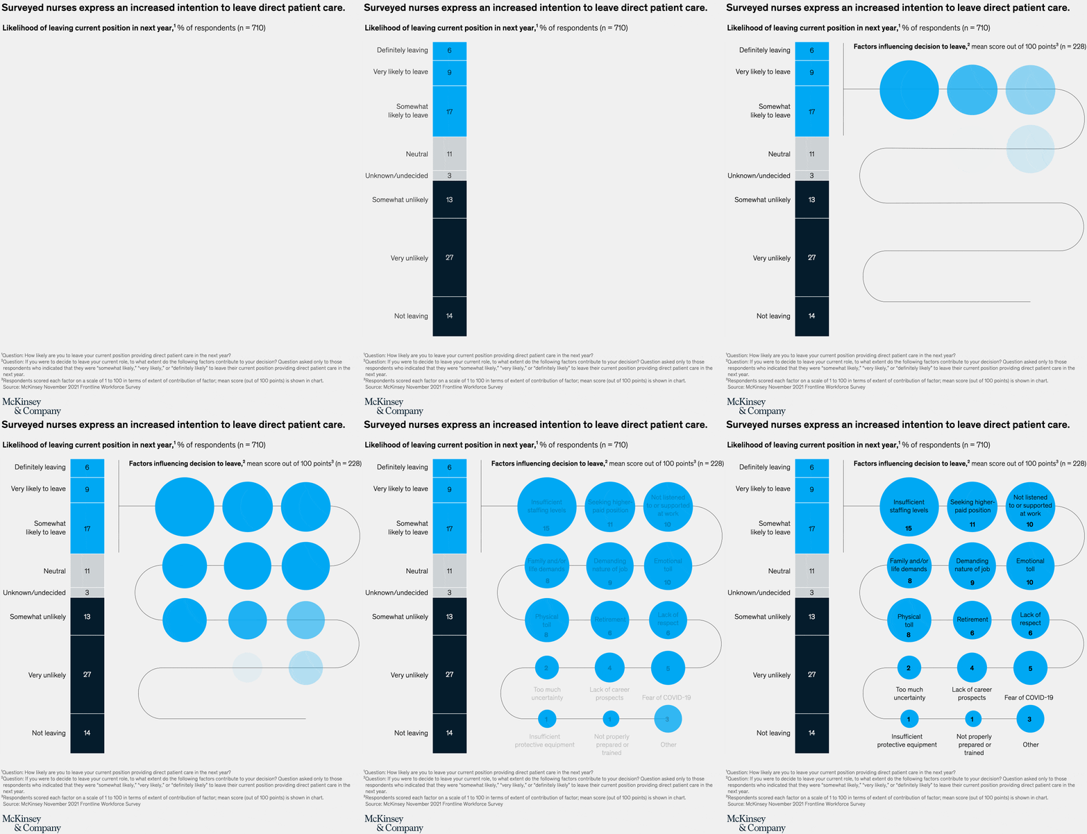
Image description:
A vertical segmented bar graph and a further breakdown of a segment of the bar graph are shown. The vertical bar graph shows a breakdown of nurses’ likelihood of leaving the profession based on their responses, which run from definitely leaving through undecided to not leaving. The top three segments of definitely leaving, very likely to leave and somewhat likely to leave add up to around 32%.
This 32% is examined further in a series of 15 factors expressed as circles that have influenced the 100% of nurse respondents who expressed some likelihood of leaving. The top three circles contain the top three reasons nurse respondents would consider leaving: insufficient staffing levels, feeling not listened to or supported at work, and looking for more compensation.
End of image description.
Inclusion opportunities abound
What does a more inclusive economy look like? Institutions across business, government, and society are taking action, but there’s more work to be done.
Black-owned beauty brands attract a fraction of the venture capital (VC) funding that non-Black-owned brands do: of the 213 VC-backed beauty companies in our research, Black brands comprise only 4 percent of late-stage VC investments. Despite the paucity of funding, Black beauty companies today have a median income that is 89 times higher than that of non-Black beauty brands. These findings highlight that racial inequity in the beauty industry is a $2.6 billion opportunity. Better serving Black consumers and supporting Black beauty brands could also lead to greater equity across the entire beauty industry.

Image description:
Two exhibits are displayed side by side.
The first contains three 100% squares representing all of the money that venture capital firms have spent in funding US beauty brands as of August 2021. The three squares from left to right are labeled total, early-stage, and late-stage funding. Within each of the 100% squares, the venture capital funding is specific to Black-owned beauty brands. This is a very small share of the total funding at 8%, early stage at 9%, and late stage at 4%.
The second exhibit shows two proportional squares side by side, representing the median value of total venture capital funding raised by US beauty companies from 2011–16 in millions of dollars. Black brands have been funded to around $5e million while all others have received around $50 million.
End of image description.
Companies are increasingly adopting a range of allyship efforts to draw a more diverse workforce, recognizing that in doing so, they expand their talent pool, boost employee engagement, and improve insight into a broader range of customers. But diversity, equity, and inclusion strategies sometimes fall short. Almost a third of surveyed LGBTQ+ employees reported experiencing microaggressions in the workplace, such as being interrupted, having their judgment questioned, or being cautious when talking about their personal lives.
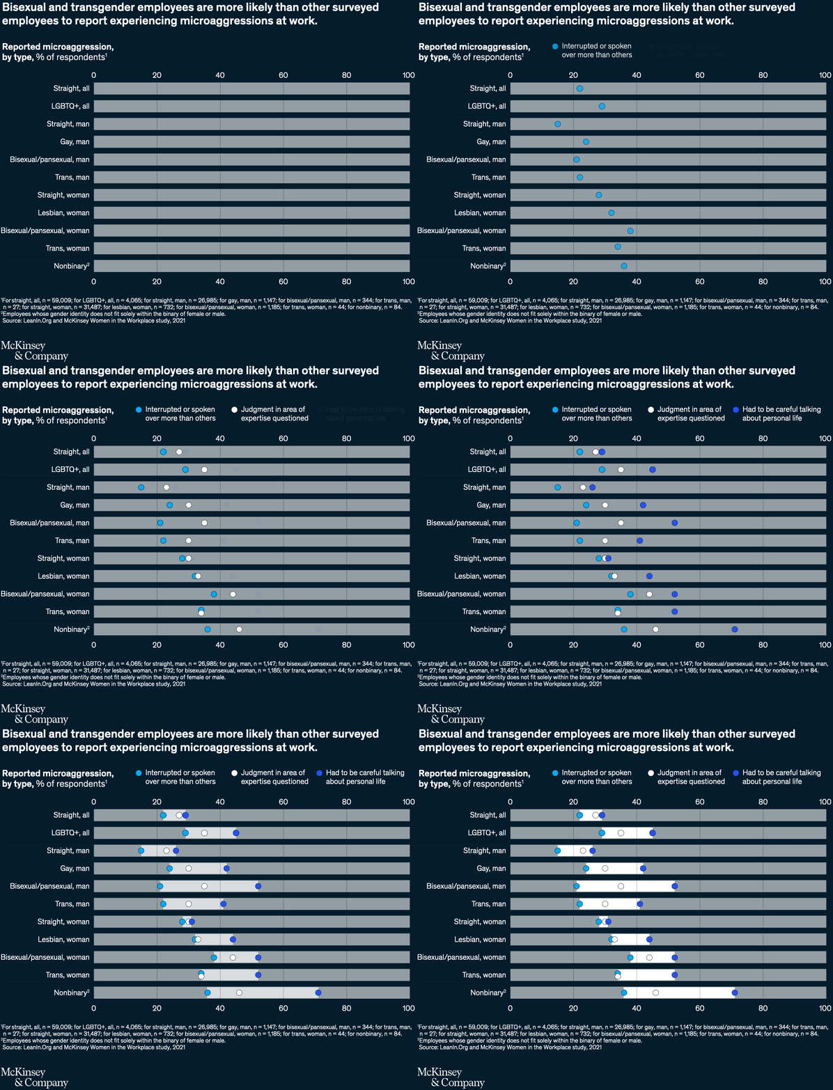
Image description:
Scattered data points, representing results of responses to three key questions about microaggressions, are organized by self-identified sexual orientation and gender. The first key question was on how often respondents were interrupted or spoken over more than others. The second key question was around how often a respondent’s judgment in their area of expertise was questioned. The third key question was on how often respondents felt they had to be careful talking about their private lives. Overall the exhibit displays that straight people, especially straight men, report the least of any aggressions, while gay men/women, bisexual/pansexual men/women, and trans men/women each report overall increasing microaggressions in that order, with nonbinary respondents seemingly most effected of all.
End of image description.
Ignoring or failing to address toxic behavior at work comes with a high price. Research by the McKinsey Health Institute found that well over half of negative workplace outcomes, such as burnout and distress, were attributable to toxic behavior at work. Organizations that don’t address the issue must deal with turnover: more than 70 percent of survey respondents indicated their intent to leave due to toxic workplace behavior alone.

Image description:
Two segmented bar graphs side by side have eight bars in total. The bars contain data on workplace outcomes based on toxic workplace behavior broken into areas of the factors likely to effect different outcomes. The five bars on the left are collected under the heading “negative outcomes,” and the three bars on the right are collected under the heading “positive outcomes.”
On the left, the five segmented bars under negative outcomes represent burnout, distress, anxiety, depression, and intent to leave. Toxic workplace behavior is by far the most important factor in each bar. On the right under positive outcomes, three segmented bars represent job satisfaction, work engagement and organizational advocacy. Toxic workplace behavior is almost invisible in these bars.
End of image description.
Frontline workers are critical to nearly all sectors of the US economy, a fact that the COVID-19 pandemic helped bring into focus. But these workers face the greatest hardship from economic disruption, and industries with low-paying frontline jobs (food services, for instance) are overrepresented by workers of color. Frontline jobs with higher-paying roles, however, such as utilities, are overrepresented by White workers.
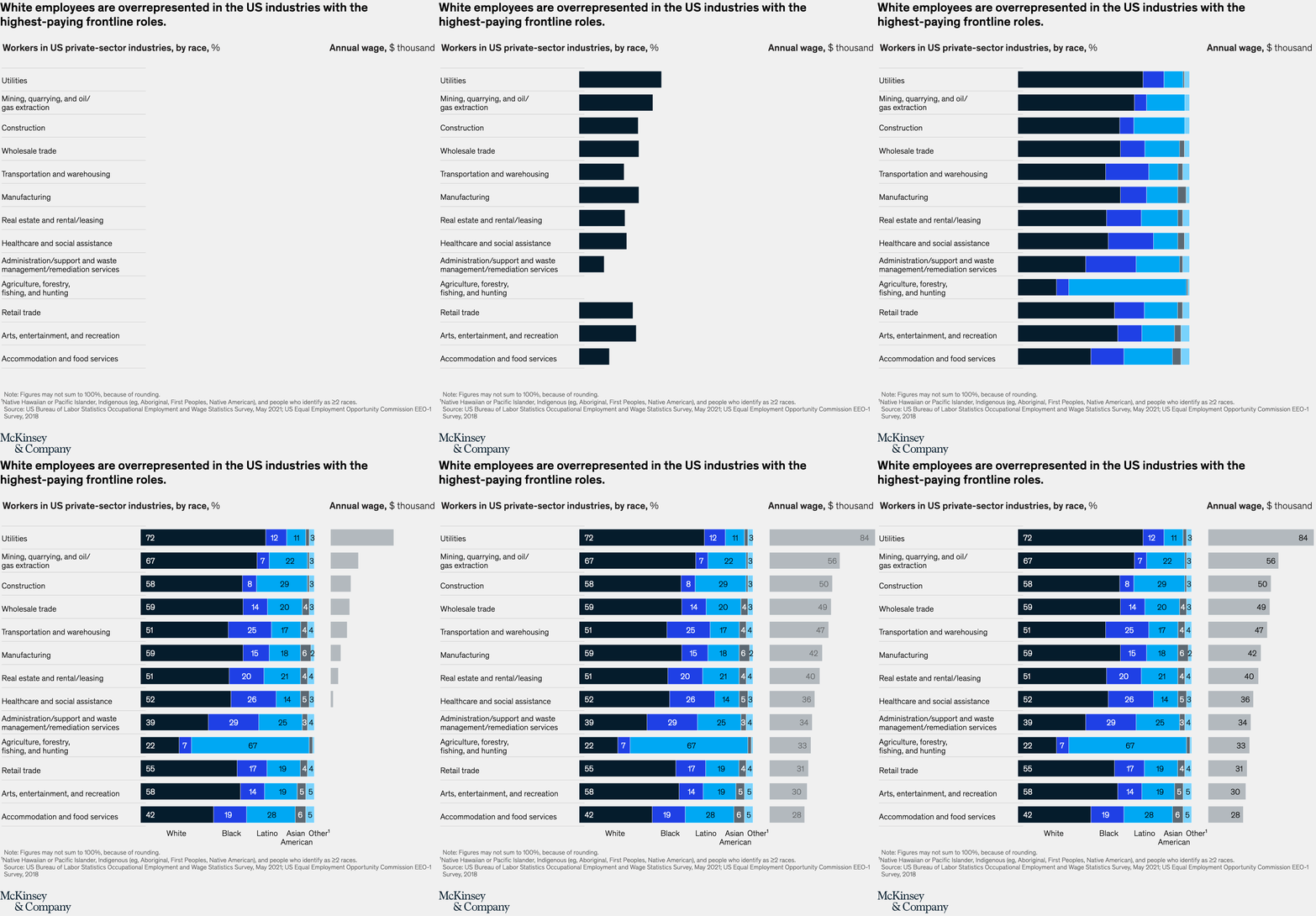
Image description:
Two charts are shown. The left-hand chart is of horizontal segmented bars broken by race, where bars represent the share of each individual race within each of thirteen private sector industries. The industry bars are ordered from top to bottom by the second of the two charts, which shows the annual wage in thousands of dollars per annum. When viewed together, it becomes apparent that certain races seem to be more prevalent in higher-paying jobs.
End of image description.
Women leaders are switching jobs at the highest rates we’ve ever seen. According to McKinsey’s latest Women in the Workplace report, women—and especially women of color—remain dramatically underrepresented in leadership roles in corporate America. If companies don’t take action, they risk losing not only their current women leaders but also the next generation of women leaders, as young women are even more ambitious and place a higher premium on working in an equitable, supportive, and inclusive workplace.

Image description:
Chart containing six vertical segmented bars. The bars represent career management levels in ascending order of seniority, including: entry level, manager, senior manager/director, vice president, senior vice president, and c-suite. The 100% bars are segmented by gender, and it is clear that, overall, the number of women dwindles and the number of men increases the closer to the C-suite we get. In a secondary segmentation by race, we see that the number of Black women and Black men dwindle faster than their White colleagues, with Black men faring slightly better.
End of image description.
Net zero has new urgency
The conflict in Ukraine and a volatile global economy may have complicated the net-zero transition, but the need to scale up climate solutions has never been more apparent. There’s an opportunity for bold leaders to build green businesses and protect the planet.
The net-zero transition could cost about $275 trillion in cumulative spending on physical assets—or approximately $9.2 trillion per year, according to our analysis. That cumulative figure is $25 trillion more than the current policies scenario. The transition to lower-emissions assets could impact multiple sectors, with three sector groups—mobility, power, and buildings—accounting for approximately 75 percent of the total spending on physical assets.
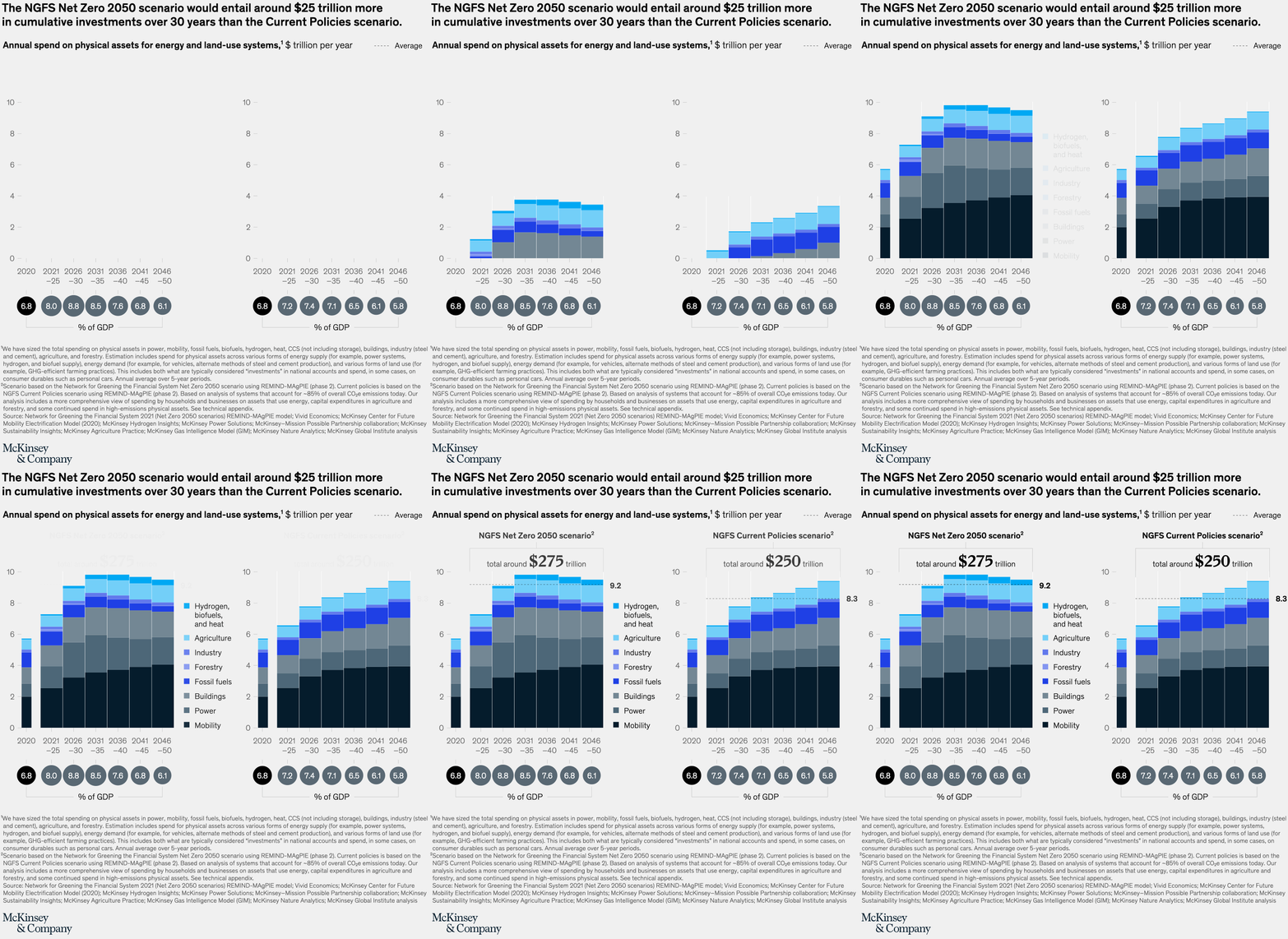
Image description:
Two charts side by side, each representing a “Network for Greening the Financial System” scenario for the cost of attaining net zero, covering the annual spending required to purchase physical assets for energy and land-use systems, measured in trillions of dollars per year. The bars represent spending required by the individual system and include segments for hydrogen biofuels and heat, agriculture, industry, forestry, fossil fuels, buildings, power and mobility. By far the largest is the mobility share. The total spend in the first Net Zero 2050 scenario is around $275 trillion, and in the second chart (the “Current Policies” scenario), the total spend is around $250 trillion.
End of image description.
The path toward net zero will lead to a surge in demand—and therefore unprecedented opportunities—for low-emissions offerings. More than $12 trillion in annual sales is expected in 11 value pools such as transport, hydrogen, and power by 2030. This transformation of the global economy could create significant growth potential for climate technologies and solutions.

Image description:
A vertical bar chart contains 11 bars that gradually grow in height from left to right. The bars represent the areas of the 11 high-potential value pools that could be worth more than $12 trillion in annual revenue by 2030. From left to right the value pools are carbon management; industrials; waste; hydrogen; then oil, gas, and fuels ; followed by agriculture and land use; then consumer; water; power; buildings; and finally transport.
End of image description.
What could the net-zero transition in the US look like? We mapped out a pathway that spans multiple sectors. Significant shifts include a zero-emissions power sector by 2035, electric vehicles comprising 75 percent of all new-car sales by 2030, and an 80 percent reduction of oil and gas methane by 2030. Such a transformation of the US economy won’t be easy for business leaders, as uncertainty surrounds the pace and scale of deploying climate solutions. But companies that assess and prepare for a net-zero economy could put themselves in a position for growth and positive impact. Click through the interactive to see what the transformation of different sectors would entail.
Recycling waste from apparel continues to be a lost opportunity—for reducing environmental impacts and creating value. Consider California, where roughly 740,000 tons of materials to produce apparel eventually enter landfills, the equivalent of an area five times the size of Los Angeles. Less than 1 percent resurfaces in future clothing via closed-loop recycling. A closed-loop recycling system for polyester alone could have a total holistic impact (economic, environmental, and social benefits) of up to $6.5 billion annually for the state. Our work on textile recycling shows that similar opportunities for value also exist in Europe.
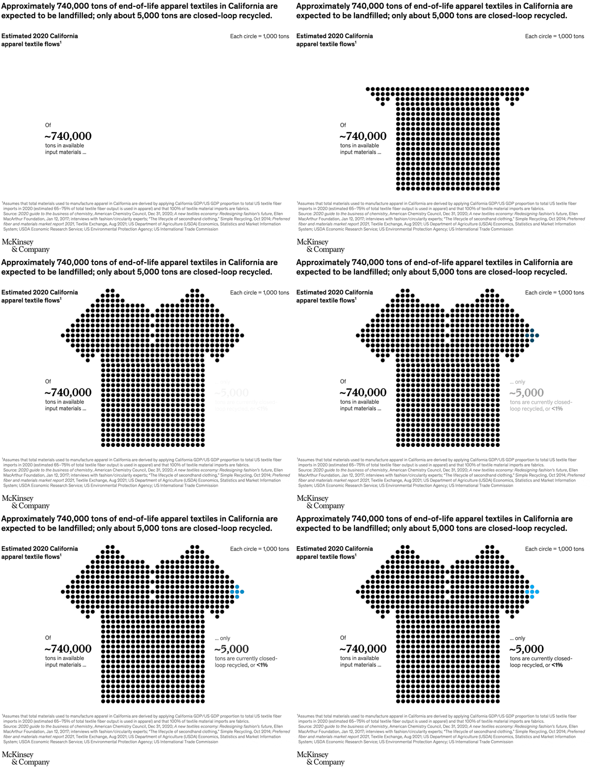
Image description:
A T-shirt created using 740 dots, each dot representing a thousand tons of end-of-life apparel textiles that are estimated to have been landfilled in California in 2020. A group of 5 of the dots are a different color, representing the tiny proportion (less than 1%) that is actively recycled in California.
End of image description.
With innovation comes responsibility
Web3, innovations in the space industry, AI ethics: technology continues to present growth opportunities for companies and raises important questions. Developing digital trust with consumers could be key going forward.
How might technology trends affect your organization? We explored 14—including digital and IT technologies, such as Web3, along with physical ones in areas such as energy and mobility—that could fuel advances in sectors from mobility to engineering to manufacturing and more. These changes could alter the competitive landscape and propel significant effects on society: reshaping markets, boosting productivity, and spurring economic growth. Click through the interactive to see how we’ve scored innovation and interest in each trend.
Semiconductors remain a hot topic. With chip demand set to rise over the coming decade, the global semiconductor industry could grow into a trillion-dollar market by 2030, with the automotive, data storage, and wireless industries accounting for about 70 percent of growth. As chip shortages have unveiled global supply chain vulnerability, the United States enacted the CHIPS Act, which is designed to boost US competitiveness, innovation, and national security.

Image description:
The image is in two parts. The first part is of two segmented bar charts for 2021 and 2030 showing the size of the global semiconductor market in billions of dollars, broken into six segments. The six segments are computing and data storage, wireless communication, automotive electronics, industrial electronics, consumer electronics, and wired communications. In 2021 the total was $590 billion, and in 2030 it is projected to be $1,065 billion, a compound annual growth rate of around 7%.
A second graph shows each individual segment’s share of the growth as a percentage of the total growth from 2021 to 2030.
End of image description.
Establishing trust in products and experiences that leverage AI, digital technologies, and data matters to consumers. According to a McKinsey survey of more than 1,300 business leaders and 3,000 consumers globally, companies that don’t deliver digital trust will find consumers taking their business elsewhere. Organizations that are best positioned to build digital trust, however, are more likely than others to see annual growth rates of at least 10 percent on their top and bottom lines.

Image description:
A three-part infographic. Part one:
A headline of: “Consumers value digital trust”
An opening paragraph says: “Consumers report that digital trust truly matters. They want companies to provide clear information about their AI and data practices, they expect rigorous data protections to be in place, and they will make purchase decisions based on these premises.”
Then a deliberately incomplete subhead says: “Consumers want transparency about digital policies ...”
End of image description.
To get a roundup of these charts delivered weekly to your inbox, sign up for The Week in Charts newsletter at McKinsey.com/subscriptions.
Our data-visualization editors Richard Johnson, Matt Perry, Jonathon Rivait, and Jessica Wang created many of the charts featured in this collection and choose the best of their creations for our daily Charting the Path to the Next Normal series. This collection was assembled by Mike Borruso, Christopher Friedmann, Richard Johnson, Stephen Landau, Katie Shearer, Andrew Simon, Amanda Soto, Sarah Thuerk, and Nathan Wilson.
This page is just part of our full year-end series celebrating the best of McKinsey Global Publishing in 2022. See the full collection at 2022 year in review.


